Hello, welcome to my blog. I introduced the concept of linear
regression in my previous posts by giving the basic intuition behind it and showing
how it can be implemented in Python. In the last post, I gave a precaution to
observe when applying linear regression to a problem – Make sure the relationship between
the dependent and independent variable is LINEAR i.e. it can be fitted with a
straight line.
So, what do we do if a straight line cannot define the
relationship between the two variables we are working with? Polynomial regression helps to solve
this problem.
Consider the scatterplot shown below
It’s obvious that the straight line in the scatter-plot does
not effectively describe the trend in the data. If we were to use this line to
predict the value of our dependent variable, we would get very poor results.
Polynomial regression fixes this problem by adding a polynomial term to the
equation for y – the predicted value.
The equation now looks like this
y = a + b1*x + b2*x^2
This is a very simple polynomial equation, it is possible to
have an equation with higher order polynomials. Here is the same scatter-plot shown above fitted with a second order polynomial.
As you can see the line curved line generated by the second
order polynomial fits the data points better than the straight line.
Going back to our case study of predicting house prices,
let’s see how a second order polynomial does on the King County dataset.
MAKING POLYNOMIAL PREDICTIONS
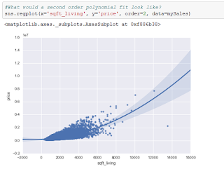
First, let us visualize the fit of a second order polynomial
on our data. I do this by using the regplot
function from the seaborn library. This
function automatically displays a best fit line for any scatterplot. In order
to request a second order polynomial fit I pass the parameter order = 2 indicating I want to see the
line generated by the second order polynomial that best fits my data. The
scatterplot is shown below
Next, let us generate a model that uses a second order
polynomial to predict house prices.
I am still using the ols function from the statsmodels.formula.api library in Python.
The only difference is that I added I(sqft_living**2) which returns the values
of sqft_living raised to power 2.
Let’s view the results
Take note of the values I circled in red – they represent the
parameter estimates of our model. We interpret them just like before. The first
term ‘Intercept’ stands for a, ‘sqft_living’
is the coefficient of x i.e. b1
and ‘I(sqft_living ** 2)’ is the coefficient of x2 i.e. b2.
Therefore, the equation for the second order polynomial that fits the data is
y = 192500 + 73.4699*x + 0.0375*x^2
Predictions
On the test data set, this model predicts a price of about $374,000
for the first house. This is slightly worse than the prices predicted by the other
models we have generated. The RSS (Residual Sum of squares – squared sum of the
difference between the actual price and the price the model predicted) for this
model on the test data is ≈ 2.54*1014.
Just to give some context, the RSS on test data for the multiple
linear regression model was ≈ 2.45*1014. The RSS on test data for the
simple linear regression model was ≈ 2.75*1014. So the polynomial
regression model had the second best performance overall.
Summary
I introduced the concept of polynomial regression which helps us
fit a non-linear relationship between two variables. I also implemented
polynomial regression in Python and we used the model to make predictions.
Thanks for reading this post. I hope you enjoyed it. If you have
any questions or comments feel free to leave a comment, I will be happy to
answer any questions you have. Thank you once again for visiting my blog.
Cheers!!!


No comments:
Post a Comment